When designing a user interface, the way error messages are displayed can significantly affect user experience and user satisfaction with the application.
Red error colors HTML are a standard way to indicate problems. They grab attention, clearly signal an issue, and improve user interface clarity.
In this blog, we’ll explore best practices for implementing red error colors in HTML using CSS and JavaScript and learn why they are vital for modern web design.
What Are Red Error Colors in HTML?
Red error colors in HTML are visual indicators used to highlight issues or errors in web applications. They are commonly applied to:
- Form validation errors
- Error alerts or warnings
- Input fields with invalid data
By using universally understood red tones, developers make error messages easy to spot and understand. Common color codes for error messages include shades of red like #FF0000, #DC143C (Crimson), and #FF6347 (Tomato).
How to Use Red Error Colors in HTML (H2)
Implementing red error colors in HTML involves a combination of HTML structure, CSS styling, and sometimes JavaScript functionality. Let’s dive into how you can achieve this:
Using Basic HTML and CSS for Error Messages
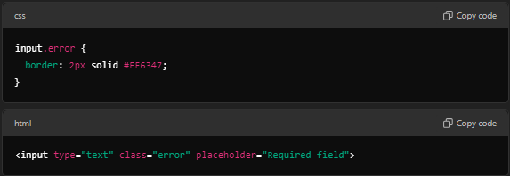
Start by structuring your HTML. Below is an example of a basic form with an error message:
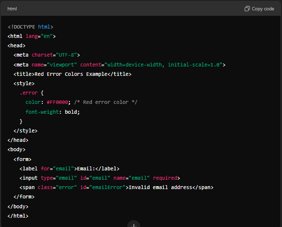
Here, the class .error applies a red color (#FF0000) to the error message text.
Advanced Error Styling with CSS (H3)
Enhance the error message visibility with advanced CSS techniques. Use background colors, borders, or animations:
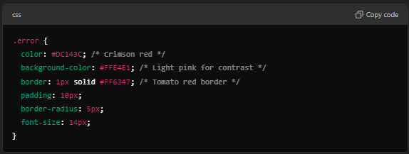
This styling ensures that error messages are clear and visually distinct, improving user experience.
Adding JavaScript for Dynamic Error Handling (H2)
In real-world applications, error messages are often generated dynamically using JavaScript. Let’s look at how to use red error colors in HTML and JavaScript:

This example dynamically shows or hides the error message when a user attempts to submit the form without entering a username.
Choosing the Right Red Color Code for Error Messages (H2)
Selecting the right shade of red is crucial for usability. Too bright, and it becomes harsh on the eyes; too dull, and it may go unnoticed. Here are some commonly used red color codes:
- #FF0000 – Bright Red
- #DC143C – Crimson
- #B22222 – Firebrick
- #FF4500 – Orange Red
For accessibility, ensure sufficient contrast between the red error color and its background. Use tools like WebAIM Contrast Checker to verify your choices.
Common Scenarios for Red Error Colors in HTML (H2)
Form Validation Errors
Highlighting invalid inputs with a red border and an error message:
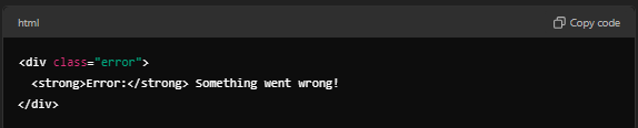
Error Alerts
For site-wide errors, a red alert box works well:
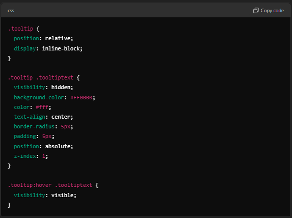
Inline Errors with Tooltips
Adding tooltips for better UX:
Best Practices for Using Red Error Colors (H2)
- Consistency: Maintain uniform shades of red across your application for a cohesive look.
- Accessibility: Ensure that error messages are readable by testing contrast and font sizes.
- Contextual Cues: Combine red error colors with descriptive icons or labels for better clarity.
- Animations: Use animations to draw attention without overwhelming the user.
Conclusion
Red error colors in HTML play a pivotal role in enhancing user experience by making errors noticeable, actionable, and easy to understand during interactions.
Whether you are working on simple forms or complex web applications, following best practices for implementing error message red color codes ensures your interface remains user-friendly and professional.
By mastering red error colors in HTML and integrating tools like CSS and JavaScript, you can create intuitive and accessible error messages that guide users effectively.
FAQs
What is the purpose of red error colors in HTML?
Red error colors highlight issues or invalid inputs, ensuring users notice and correct them quickly.
Which color codes are commonly used for error messages?
Common codes include #FF0000 (Red), #DC143C (Crimson), and #B22222 (Firebrick).
How can I style error messages in HTML?
Use CSS properties like color, background-color, and border to make error messages visually distinct.
How do I dynamically show error messages in forms?
Use JavaScript to display or hide error messages based on input validation results.
Why are red error colors widely used?
Red universally symbolizes alerts, making it an effective choice for error communication.
How do I ensure accessibility for error messages?
Ensure sufficient contrast and include descriptive text for screen readers.
Can I use animations for error messages?
Yes, subtle animations can make error messages more noticeable without overwhelming users.
What tools can help me choose the right red?
Use tools like the WebAIM Contrast Checker to test readability.