Graphic design plays a crucial role in branding, marketing, and communication. A well-crafted design can effectively convey a message, evoke emotions, and create a lasting impression.
However, Bad graphic design can have the opposite effect, making content difficult to understand, unappealing, or even damaging to a brand’s reputation.
In this article, we will explore common graphic design mistakes, their impact, and how to avoid them to create visually appealing and effective designs.
What is Bad Graphic Design?

Bad graphic design refers to visuals that fail to communicate effectively due to poor layout, typography, color choices, or composition.
These designs often appear cluttered, difficult to read, or aesthetically unpleasing. Whether it’s a business logo, website, or marketing material, poor design can drive away potential customers and diminish credibility.
Common Graphic Design Mistakes
Poor Typography Choices
Typography is an essential part of design, yet one of the most commonly misused elements. Mistakes include:
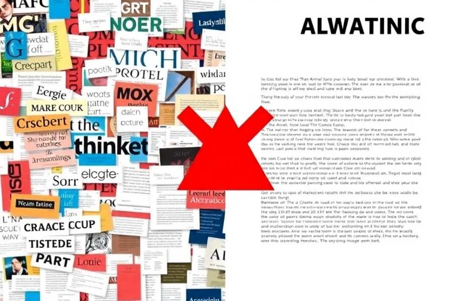
- Using too many fonts: This creates a chaotic and unprofessional look.
- Poor kerning and spacing: Uneven spacing between letters can make text difficult to read or unintentionally spell inappropriate words.
- Hard-to-read fonts: Overly decorative or small fonts reduce readability.
A classic example of typography failure is the BULL TITAN US logo, which, due to poor spacing, ended up forming an entirely unintended message.
Another example is the SLIX logo, where incorrect kerning led to an unfortunate misinterpretation of the brand name.
How to Fix It: Stick to 2-3 complementary fonts and ensure proper spacing for clarity and balance.
Inconsistent Color Schemes
Colors influence emotions and perceptions, but bad color choices can make a design look unprofessional or difficult to read. Common mistakes include:
- Clashing colors that hurt the eyes.
- Too many colors making the design overwhelming.
- Lack of contrast reducing readability.
An example of poor color choice is the Ready Player One movie poster, which faced criticism due to its confusing color composition and design flaws that made the character appear distorted.
How to Fix It: Use a limited color palette and ensure sufficient contrast between text and background.
Overcrowded Design
Too much text, images, or elements in a single design can overwhelm viewers, making it difficult to focus on the key message.
A prime example is an over-stylized event poster with excessive fonts and colors, where the lack of white space made the design visually exhausting.
How to Fix It: Utilize whitespace effectively to create a balanced composition that guides the viewer’s eye.
Lack of Hierarchy
Without a clear visual hierarchy, viewers may struggle to determine the most important information in a design.
How to Fix It: Use font sizes, boldness, colors, and positioning to prioritize key elements.
Low-Quality Images and Graphics
Pixelated or stretched images reduce the professionalism of a design. A prime example of this issue can be seen in outdated website designs such as Craigslist and Berkshire Hathaway, where the use of minimal and outdated visuals makes the websites look unprofessional and difficult to navigate.
How to Fix It: Always use high-resolution images and vector graphics to maintain clarity.
Ignoring Alignment and Proximity
Misaligned elements create a disorganized look, reducing the effectiveness of the design.
How to Fix It: Ensure consistency in alignment and group related elements together for better readability.
Poor Logo Design
Logos represent a brand, but bad designs can send the wrong message. One of the most infamous logo design failures is the Arlington Pediatric Center logo, which unintentionally created inappropriate visual associations.
Another major failure was the London 2012 Olympics logo, which faced widespread criticism for its fragmented and chaotic appearance, leading to misinterpretations worldwide.
How to Fix It: Keep logos simple, versatile, and meaningful.
Famous Examples of Bad Graphic Design
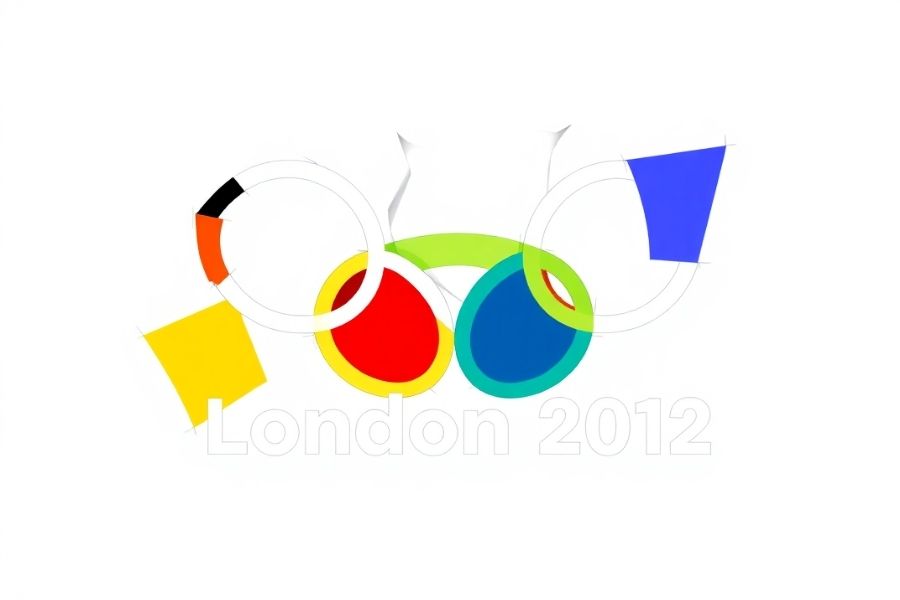
London 2012 Olympic Logo
The logo was intended to represent a modern, edgy look but was widely criticized for its abstract design that many found confusing.
Gap Logo Redesign (2010)
Gap’s attempt at modernization backfired as customers disliked the generic and uninspired new logo, leading to its quick reversal.
X (Formerly Twitter) Logo
The transition from Twitter’s iconic bird to a simple ‘X’ was met with mixed reactions, showing how risky drastic rebranding can be.
X-Men: First Class Movie Posters
The posters for this Marvel movie were widely mocked for their poor execution, with character faces awkwardly blended into silhouettes, making the design look unprofessional and laughable.
Yale School of Art Website
Despite being a prestigious institution, the Yale School of Art’s website appears outdated and unstructured, resembling a design experiment gone wrong.
How to Avoid Bad Graphic Design

- Plan before designing – Sketch out ideas and get feedback.
- Stick to design principles – Follow contrast, alignment, repetition, and proximity (C.R.A.P. principle).
- Get feedback – Have multiple people review the design before finalizing.
- Keep it simple – Minimalism often leads to more effective designs.
- Use professional tools – Software like Adobe Illustrator, Photoshop, and Canva can help achieve polished results.
Final Thoughts
Bad graphic design can ruin branding, marketing efforts, and user experience. By understanding common mistakes and applying good design principles, businesses and individuals can create effective, visually appealing designs that resonate with their audience.
Always prioritize clarity, simplicity, and audience perception to ensure successful communication through design.
FAQs
What is bad graphic design?
Bad graphic design refers to visuals that fail to communicate effectively due to poor layout, typography, color choices, or composition.
How does bad graphic design affect a brand?
It can make a brand look unprofessional, reduce credibility, and drive away potential customers.
What are the most common graphic design mistakes?
Common mistakes include poor typography, inconsistent color schemes, overcrowded layouts, and low-quality images.
How can I improve typography in design?
Use a maximum of 2-3 complementary fonts, ensure proper spacing, and choose readable typefaces.
Why is color selection important in design?
Colors influence emotions and readability, and a poor palette can make a design unattractive or difficult to understand.
How can I create a visually balanced design?
Utilize whitespace, maintain alignment, and establish a clear visual hierarchy.
What are some examples of Bad graphic design?
Examples include the London 2012 Olympics logo and the Arlington Pediatric Center logo, which faced criticism for poor execution.
How can I ensure my images look professional in a design?
Always use high-resolution images and vector graphics to maintain clarity and avoid pixelation.
What tools can help me create better designs?
Professional tools like Adobe Illustrator, Photoshop, and Canva can help achieve polished and visually appealing results.