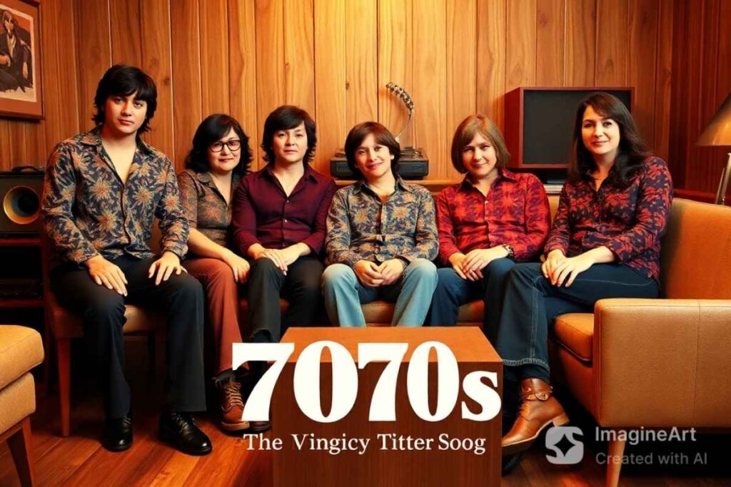
The 1970s was a revolutionary decade for graphic design, filled with bold colors, psychedelic patterns, and experimental typography.
Emerging technologies and cultural movements significantly influenced the visual aesthetics of the era, making 70s graphic design a unique and lasting inspiration for modern designers.
This article explores the defining characteristics of graphic design in the 70s, from typography and color schemes to photography and patterns.
Typography in 70s Graphic Design
Typography played a significant role in graphic design 70s aesthetics. Designers moved away from the rigid styles of previous decades and embraced more fluid, freeform lettering. Two key innovations influenced typography trends:
Letraset Transfer Lettering
Letraset introduced dry-transfer lettering sheets, allowing designers to apply fonts easily without requiring professional printing presses. This made creative typography accessible to a broader audience, including amateurs and professionals alike.
Phototypesetting
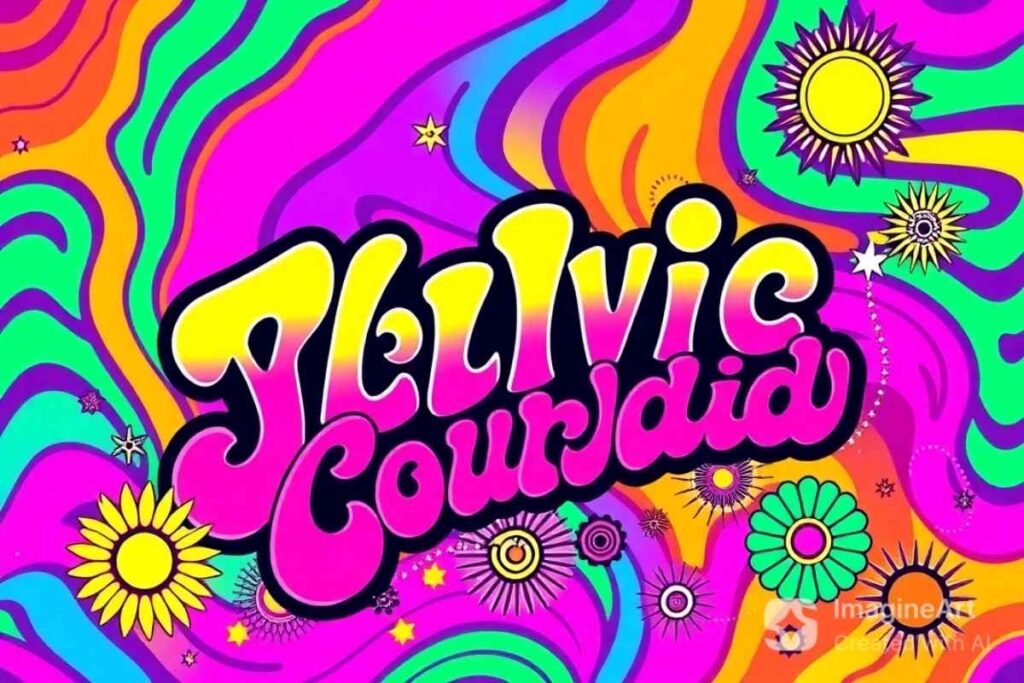
The Visual Graphics Corporation’s PhotoTypositor allowed graphic designers to manipulate letter spacing and apply distortions, leading to new and exciting font styles. The result was a departure from conventional typography, giving rise to three major font trends:
- Swirling Swashes: Decorative, exaggerated serifs that enhanced artistic expression.
- Groovy Bubble Fonts: Soft, curvy lettering that reflected the carefree spirit of the time.
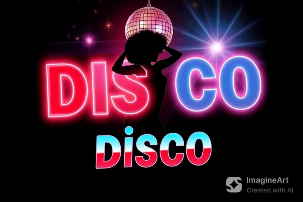
- Disco Fonts: Multi-line, neon-inspired typography reflecting the vibrant disco culture.
Color Trends of 70s Graphic Design
The graphic design in the 70s era was characterized by a mix of earthy and vibrant colors. Warm tones like mustard yellow, burnt orange, and avocado green dominated interior and fashion design, while graphic design featured brighter, more psychedelic hues.
The shift in color trends reflected social and political changes. With rising environmental awareness and movements for peace, natural colors gained prominence.
However, the introduction of the Rainbow Flag in 1978, designed by Gilbert Baker, brought multicolored palettes into mainstream design, further influencing posters, album covers, and advertisements.
Photography in 70s Graphic Design
Unlike previous decades that relied heavily on illustrations, the graphic design 70s era saw a surge in photography-based advertising.
Brands started using real people instead of idealized illustrations to promote products, making ads feel more authentic.
Additionally, the rise of celebrity endorsements transformed marketing strategies, making photography an essential element of 70s advertising.
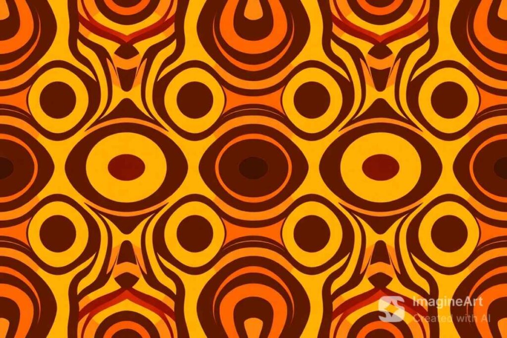
Bold Shapes and Patterns
While some designers embraced intricate, swirling psychedelic patterns, others opted for minimalist, geometric compositions inspired by designers like Saul Bass. Simple yet striking layouts used bold shapes, flat colors, and abstraction to convey complex ideas. Patterns from the 70s included:
- Swirling, wavy lines: Inspired by psychedelic art from the 60s.
- Geometric and optical illusions: Creating mesmerizing, hypnotic visuals.
- Repetitive motifs: Used in wallpapers, textiles, and advertising backgrounds.
Modern Influence of 70s Graphic Design
The bold and experimental nature of 70s graphic design continues to inspire modern creatives. Retro fonts, groovy patterns, and vibrant color schemes have made a resurgence in contemporary branding, social media design, and digital art.
Tools like Vectornator and Adobe Illustrator allow designers to recreate the fluid typography and psychedelic patterns of the era with ease.
How to Incorporate 70s Design into Your Work
- Use warm earthy tones or bright psychedelic hues.
- Experiment with freeform typography and groovy fonts.
- Incorporate hand-drawn elements for an authentic retro feel.
- Play with bold geometric shapes and swirling patterns.
Conclusion
The graphic design in the 70s was a time of artistic freedom and innovation. Whether you love the disco-inspired neon fonts or the earthy, natural aesthetics, there’s no denying the lasting impact of 70s graphic design.
With the rise of retro trends in modern design, looking back at this iconic decade can provide endless inspiration for today’s creatives.
FAQs
What are the key characteristics of 70s graphic design?
Bold typography, vibrant colors, psychedelic patterns, and geometric compositions defined the era.
How did typography evolve in the 70s?
Designers experimented with swirly, groovy, and disco-inspired fonts, pushing creative boundaries.
What colors were popular in 70s graphic design?
Warm earthy tones like mustard yellow and burnt orange mixed with psychedelic neon hues.
How did photography impact graphic design in the 70s?
Photography became a dominant tool in advertising, shifting towards realism and celebrity endorsements.
What role did patterns play in 70s design?
Hypnotic swirls, geometric shapes, and organic curves were widely used in branding and decor.
How does 70s graphic design influence modern trends?
Retro fonts, bold colors, and freeform layouts are making a comeback in branding and digital design.
How can I incorporate 70s design into my projects?
Use earthy or neon colors, playful typography, and mix photography with illustrated elements.
Why is 70s graphic design still relevant today?
Its fearless creativity and boundary-pushing aesthetics continue to inspire contemporary designers.