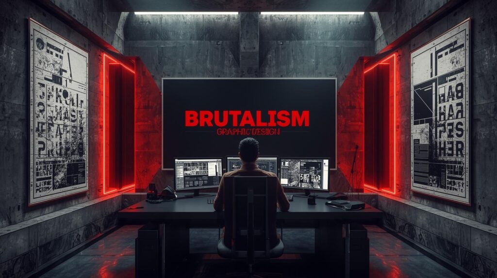
Scroll through design feeds and you’ll spot one unapologetic movement cutting through the brand polish of 2025 Brutalism graphic design. It looks rough unexpected sometimes awkward yet every element grabs attention.
This guide dives deep into the origin the reasoning the examples and the techniques that make Brutalism more than an aesthetic. It’s a philosophy that turns imperfection into identity.
Brutalism refuses harmony for the sake of truth. In a world obsessed with perfect UX and symmetrical layouts its appeal lies in honesty showing the bones of design instead of hiding behind glossy decoration. It’s the art of exposing structure tension and humanity.
Roots of Brutalism in Design
Every movement in design starts as a reaction to its time and Brutalism was no different. It grew from an age rebuilding after destruction an era that valued strength, truth and structure over luxury.
Where earlier styles hid their framework behind ornament Brutalism exposed it proudly. The honest weight of concrete in architecture soon inspired the same honesty in visual communication: type, layout and composition used not to decorate but to reveal purpose.
From Raw Concrete to Raw Typography
The term Brutalism appeared after World War II to describe the concrete structures of architects Le Corbusier and Alison and Peter Smithson. They championed béton brut raw concrete as a symbol of integrity and function.
Their buildings wore their materials openly rejecting polish as a form of deception. Graphic designers later carried that spirit into print. They translated slabs of concrete into blocks of type, grids and visible construction lines.
The Bauhaus and Constructivist principles of form follows function resurfaced here with more aggression. Brutalism pushed functionalism so far that the structure itself became the art.
A Rebellion Against Decoration
By the 1990s, digital design had turn soft templates glowed with gradients and symmetry. Then came a backlash. Designers who had grown up on HTML code and early internet forums felt nostalgic for its rough edges.
They preferred sites that showed their grids and layer orders instead of hiding them. That anti aesthetic impulse sparked modern Brutalism graphic design.
It was less a style than a statement If design pretends to be perfect it lies if it shows its imperfections it tells the truth. Raw typography, scrollbars and visible HTML became the new expressionism the concrete of our digital age.
The Philosophy: Structure as Honesty!
Brutalism is the opposite of fluff. It’s communication stripped to function.
At its core it works through five truths:
- Function before beauty: the message is priority decoration secondary.
- Visibility of construction: no hidden layers grids and margins stay visible.
- Typography as architecture: letters become building blocks.
- Contrast as emotion: black vs white neon vs gray to create psychological impact.
- Imperfection as personality: visual asymmetry makes the design human.
Designers describe it as “visual truth telling” nothing pretends to be flawless yet everything has purpose.
From Architecture to Graphics: Milestones!
Brutalism’s journey from cement and steel to screens and pixels is a story of translation. What began as a philosophy of architecture honesty through structure and function slowly migrated into the visual communication world.
Designers realized that the principles guiding buildings could also guide typography, branding and digital interfaces. Instead of walls and beams Brutalist graphic design uses grids, text and layout systems to express the same stark honesty and utilitarian focus.
Each generation of artists transformed these architectural values into its own creative language from print and music covers to modern web pages.
The Modernist Bridge
As architecture evolved toward functionality graphic design followed. In 1972, Otl Aicher’s Munich Olympic identity illustrated how clarity and geometry could replace ornamentation without losing beauty.
His system of color coded pictograms was designed for people not prestige simple functional but visually commanding. It became a prototype for what would later be called Brutalist structured communication without disguise.
By the 1980s, the concept escaped institutional boundaries. Album designers and underground magazines like punk zines adopted cheap type, photocopies and hand cut layouts to make a statement against corporate advertising gloss.
Those raw tactile publications were Modernism’s rough children direct, honest and defiantly anti decorative.
Digital Awakening
Fast forward to the 2010s the internet shaped a new canvas for this old ethic. In 2014 Swiss designer Pascal Deville founded BrutalistWebsites.com an online gallery collecting sites that violated corporate design norms.
Plain borders, default fonts and blinding colors suddenly became symbols of authenticity. Deville’s archive re introduced honest HTML as art and cemented digital Brutalism graphic design as a global movement.
What once was concrete and paper now existed as pixels and code different material same honesty.
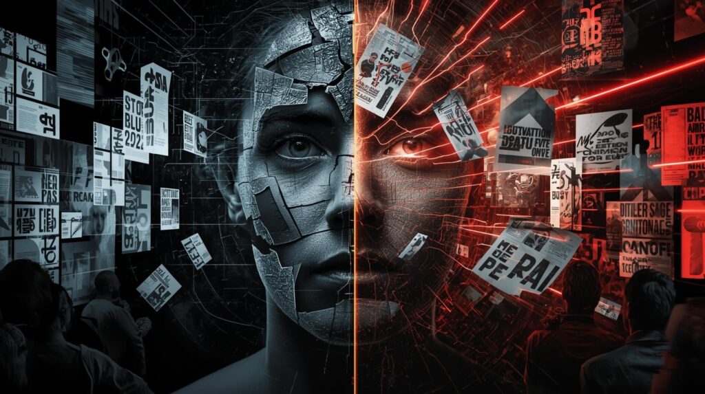
Visual Language How It Looks and Feels?
Typography
Default system fonts like Arial, Times New Roman, or Courier define the movement. Brutalist typography often uses oversized letters that break boundaries frequently all caps with tight leading. The goal is impact not elegance.
Layouts
Forget perfect symmetry. Designers show the grid or experiment with asymmetry. Paragraphs might touch the edge of the page images bleed off screen. This dissonance makes audiences linger and interact.
Color & Texture
Two dominant routes exist monochrome black white gray or dangerous neon combinations (purple/lime red/black). Rough textures imitate cement, grain or printer noise to preserve the raw tone.
Imagery
Low resolution photos, bitmap icons and glitchy collages replace stock imagery. Every imperfection is deliberate.
Brutalism Graphic Design Ideas for 2025
The new generation of designers takes Brutalism beyond rebellion into experimentation.
- Use visible margins and default buttons in web pages to reveal HTML roots.
- Overlay type directly on imagery viewers read through landscape and message simultaneously.
- Play with motion: scrolling marquees and sudden color flashes mimic tension of architectural light and shadow.
- Incorporate AI generated imperfections (GAN noise, data textures) to illustrate the meeting of machine and human error.
These techniques aren’t random each serves to pull attention back to content. That’s why Brutalism remains effective for campaigns that need instant recognition.
Iconic Brutalism Graphic Design Examples
The best way to understand Brutalism is to see it in action. Across music, publishing, fashion and digital branding certain projects have defined how raw design can speak louder than refined aesthetics.
These examples show that when truth is visible on the page or screen people trust the message instantly.
- The Beatles’ White Album (1968) by Richard Hamilton: minimal white sleeve as social comment.
- Bloomberg Businessweek (2010, 2014) under Richard Turley: aggressive typography that broke magazine conventions.
- Balenciaga’s Website: monochrome shop interface with unfiltered photography.
- The Face Magazine Relaunch: asymmetric layouts and oversized font hierarchy.
- Telfar’s Brand Identity: digital simplicity married to radical legibility for accessibility and authenticity.
Each project proved that raw design communicates faster than polish because honesty builds trust in the viewer.
Neo Brutalism: Digital Evolution!
“Neo Brutalism” describes designers who merge the old rawness with today’s technology. You’ll see it in interfaces that use flat colors and default UI components yet deliver sophisticated UX. Minimal code maximum statement.
In Neo Brutalism, layers of motion and AI effects build depth without losing function. Sites by studios like Wunder Werkz and HAWRAF employ scroll distortion and interactive grids to visualize the tension between machine order and human chaos.
It’s becoming the visual voice of Gen Z brands that reject corporate tone but demand speed and clarity bold, fast and functional.
Brutalism Graphic Design Fonts and Posters
Typography and posters remain the movement’s strongest medium.
Font Approach
Choose typefaces that feel industrial or utilitarian Arial Black, Helvetica Bold, DIN 2014, Neue Haas Unica or system monospace. Most designers manipulate weight and tracking to create tension rather than balance.
Add visible wrapping errors and breaking lines intentionally it humanizes digital texts.
Poster Design
A Brutalism graphic design poster relies on asymmetrical composition and direct messaging. Pair huge type with a small image or use blank space subversively.
Contrast is everything white paper with blacker than black ink or a hot red rectangle that cuts visual silence. Each poster is a visual shout.
Resource Packs
Many designers use Brutalism graphic design packs or texture sets from Adobe Stock, Envato and community collections on Pinterest. They offer templates with mixed grids and grunge overlays that speed up production without losing authenticity.
Wallpapers and Digital Assets
Because of its minimal code and strong contrast Brutalism translates well to wallpapers and UI backgrounds. Designers create Brutalism graphic design wallpapers that combine one word (RAW, STRUCTURE, TRUTH) in monochrome type with texture layers of cement, metal or grain.
They perform well on Pinterest and Instagram where authentic and industrial visual themes trend.
These assets demonstrate how Brutalism can coexist with minimalism a mute palette but charged emotion.
Why Designers Choose Brutalism Today
In an era where brands compete to appear flawless many designers are turning to Brutalism for its honesty and speed. The movement offers creative freedom and a sense of realness that algorithm polished designs can’t match. Its imperfections don’t weaken a brand they humanize it.
- Authenticity: Audiences trust visuals that admit their imperfections.
- Speed & Efficiency: Less decoration means faster load times and print production.
- Memorability: A little awkwardness burns into memory faster than neutral perfection.
- Freedom: There are no strict rules to please corporate aesthetics.
As AI fills feeds with polish, human error has become new gold.
The Psychology and Cultural Resonance
Brutalism hits that human nerve where discomfort meets engagement. Neuroscience backs it our brains spike attention when patterns break. That micro disruption is why edgy layouts excel in digital marketing.
Socially Brutalism aligns with modern values of transparency and authentic branding. Viewers feel that unrefined designs are “real”. This emotional honesty builds stronger brand relationships than sterile aesthetics.
Balancing Brutalism and Accessibility
True professionals keep the rebellion readable. Contrast and hierarchy matter. Oversized type must still be legible color choices should meet accessibility contrast ratios. That balance between chaos and clarity is what makes award winning Brutalist work stand out instead of alienating.
Brutalism vs Minimalism: Honesty or Harmony?
Minimalism calms Brutalism provokes. Both derive from modernism but serve different emotions.
Combine them and you get timeless hybrids simple layouts with one brutal twist (a misaligned header, an exposed grid). That’s where current UI/UX experiments live clean functionality spiced by raw personality.
The Future of Brutalism Graphic Design
AI automation gives neutral perfection at scale and that’s exactly why Brutalism will survive. While machines standardize beauty humans will value imperfection as signature.
Expect three directions:
Eco Brutalism: sustainable materials and organic textures in print.
Data Brutalism: visualizing information with bare numbers and grids as art.
AI Hybrid Brutalism: machines generate structure designers inject flaws.
These fusions will make Brutalism the moral counterbalance to algorithmic aesthetics.
Conclusion
Brutalism graphic design proves that clarity can emerge from chaos and beauty from bold truthfulness. It reminds creatives that audiences don’t connect to flawless perfection but to authentic expression.
From postwar posters to AI screens its language stays the same structure is beautiful when it has nothing to hide.
So let your next project show its skeleton its grids, textures and imperfections. That human rawness might be the most stable source of traffic, trust and timeless appeal a designer can achieve.
FAQs
Where is Brutalism used most today?
Fashion, music and digital brands use it to stand from corporate minimalism and to communicate authenticity.
How can a beginner practice Brutalism graphic design?
Start by breaking grid rules, using default fonts and focusing on clear message delivery instead of perfect symmetry.
Do Brutalist designs affect website performance?
They often load faster because they avoid heavy graphics and animations, favoring plain HTML elements and flat color.
Is Brutalism accessible to all users?
Yes if contrast and font size are managed well. Content clarity matters more than visual polish so usability can stay strong.
Which fonts look best for Brutalist projects?
Fonts like Arial Black, Courier, Helvetica Bold and Neue Haas Unica fit perfectly because they’re clean, simple and industrial.
Can Brutalism and Minimalism work together?
Yes many modern designers combine minimal layouts with Brutalist type and texture to balance clarity and intensity.